Professor Sheena Iengar, an American psychologist, is an authority on choice psychology who has conducted various studies on human choice. Of the many studies she has conducted, experiments on the number of choices are quite famous.
The researchers first made two shelves in a supermarket in the United States. Six kinds of jam were displayed on one stand, allowing passersby to sample and purchase, and 24 kinds of jam were displayed on the other. And we watched which stands the actual customers stopped by and bought more products.
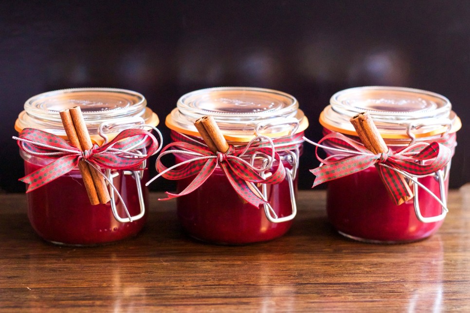
TesaPhotography: https://www.needpix.com/photo/521174/jam-jar-christmas-homemade-cranberry-gift-natu
As a result of the experiment, 60% of customers stopped by the stand where 24 types of jam were displayed, and 40% of customers stopped by the stand where 6 types of jam were displayed. So far, you’d expect that the more jam types would be more advantageous, but the percentage of customers who actually purchased jam was 3% for 24 types of jam and 30% for 6 types of jam, and the sales rate for 6 types of jam was nearly 10 times higher.
The number of products on display also made a difference in terms of sales. As expected, the sales of the stand with six types of jam were nearly seven times higher, and the purchase satisfaction was higher. In response, Professor Ienga says, “More choices than necessary act as mental noise, rather hindering the choice, and the wider the choice, the more hesitant you are to avoid disappointment when the choice goes wrong.” This is called choice overload in psychology. Similarly, psychologist Jacob Jacoby says, “The amount of information that humans can process is limited, and beyond this range of information, it can interfere with problem solving or learning.” [2]I remember Baek Jong-won advising the cast to focus on the core menu by reducing the number of restaurant menus in the TV program Alley Restaurant.
So what are the appropriate options or numbers of information to prevent overloading of choices? To talk about this, you must understand the concept of chunk. First, read the alphabet below.
LSDMBCKBS
Did you notice anything? The alphabet above is a list of nine alphabets that have no special meaning if you look at each of them, but in fact, it has meaning when you look at them in groups of three letters. They can be grouped into LSD, MBC, and KBS, respectively. In the field of cognitive science, a chunk is a unit of memory that brings together such information. If you don’t know LSD, MBC, or KBS, it’s a sentence consisting of nine chunks, and if you know three words, it’s three chunks. And the memory unit that compressed MBC and KBS into ‘two of the major terrestrial broadcasters’ is called ‘Schema’. It’s like a video compression codec.

Each alphabet consists of individual information, chunks of information, and schemas that code chunks.
Back to selection, various theories about appropriate selection or the number of pieces of information usually talk about this chunk in units. Professor George Miller, a renowned psychologist, argued that the limit of information that humans can store in working memory is 7±2 [3]It’s called Magic No.7 and it’s a famous concept that anyone who’s interested in design, cognitive science, and psychology might have heard of at least once. But a follow-up study by psychologists Alan Baddeley and Nelson Cowan suggests that this 7±2 number is wrong, and that the actual appropriate number is close to 4 [4].
In fact, I wonder if there really is a magic number that anyone can easily remember. Rather, what’s important to note from previous studies is that when a person remembers a particular piece of information or makes decisions based on presented information, it’s good to reduce the number of possible choices or information through chunking.
Apple recommends three to five appropriate number of iPhone UITabBar through the Human Interface Guideline (HIG) [5]. Mobile games, on the other hand, often show the number of products you see for the first time when you enter the store and encourage you to scroll to see more. To be honest, this design is relatively simple. Compared to the Main Lobby design.
The main lobby is the first space that users encounter when playing a game, and it is a space where they can identify and manage overall game information such as game play progress, goods possession status, sub-content, or events. The problem is that depending on the genre of the game, there are at least 10 menu buttons in the main lobby, and more than 20 to 30 menu buttons should be placed on one screen in one genre such as collective RPG or MMORPG. And chunk is the key to solving this problem. No matter how many menus you have to offer, if you categorize menus of similar functionality or importance and create semantic chunks, complex menus may look as less complicated as possible.

Rise of Kings (Lillith Games) and Brawl Stars (Supercell) main lobby menu chunking example
Rise of Kings (Lillith Games) or Brawl Stars (Supercell) shows that menus are chunked into five to six categories based on content importance or similarity in functionality. Similar characteristics can also be found in more casual puzzle genres such as Toon Blast (Peek games) and Candy crush friends saga (King.com). This clearly chunking and providing the menu to the user makes it much easier for the user to remember and learn each menu.

A Case of Menu Chunking in a Relatively Casual Genre
In addition, in most of the cases mentioned above, there are two more factors to look out for when chunking a menu. First, in order for a chunked menu to be clearly recognized by the user, the spacing or visual grouping of the menus must be clear. If the visual grouping of the menu buttons is not clear, as shown in the example below, it will be very difficult for users to learn the menu in chunks.

The visual grouping of the menu buttons must be clear.
Second, if chunking has cleaned up the game’s most important core menu, it should be placed in the most touchable position and made visible to the user. Fortunately, discussions on the Thumb zone [6] have been actively conducted in the mobile environment considering the range of the user’s thumb touch. If it’s an important menu button in the game, it should be placed within the safe zone of Thumb Zone to increase user usability.

Thumb zone: Easy to touch area when using thumb
Last year or so, by chance, I had a conversation with a UX designer at Apple’s headquarters about the main lobby menu for a mobile game menu. She looked at the main lobby screen of the game I participated in the development and said, “Terribble”…He didn’t hesitate to say that, so he gave him a powerful trauma (…).i) Because the main lobby of the game, which has been live for years, felt very complicated and untidy. Fortunately, she shared a tip with me.
“Write down the menu on a post-it and group it according to the importance or function”

Card Sorting Case (https://www.dreamerux.com/articles/fycrs9ssjdxrsxdtz2bmh96y8n78t3)
It proposed a way to organize the menu through so-called “card sorting.” Card sorting is a method of investigation that allows users to group and represent prepared cards how they perceive the information and structure inside the product [7]. The brief sequence is as follows.
1. All of the card sorting program participants will write down the menu on the yellow card (post-it) that must be provided to the user in the main lobby and paste it in an empty space such as a wall.
2. From the user’s perspective, list cards with similar functions or importance. It requires a lot of dialogue and discussion between participants.
3. Once the participants have reached an agreement on card grouping, write down a short word or sentence that represents each card group on a blue card and paste it at the top of that card group.
It also requires a lot of dialogue and discussion.
4. Group if there is a similarity between the blue cards, write a short word or sentence that represents the group on the pink card and paste it at the top of the group.
5. Finally, adjust the order in which card groups are listed according to their importance.
Immediately after the meeting, I did card sorting with my team members and updated the game by reflecting the results in the main lobby design. And fortunately, we were able to see the community’s response that the menu became cleaner. If you are worried about the complicated main lobby screen of the game you are developing, we recommend you to use card sorting to organize the menu.